Playdate User Experience and Accessibility Check List
Table of Contents
This guide is our attempt to list usability and accessibility concerns you should keep in mind. We’d like your game to be pleasant and playable by as many people as possible. Note that we also have a document on Designing for Playdate, which overlaps this information somewhat covers other aspects of designing great Playdate games.
Performance
We expect the gameplay to run smoothly. Frame rate above 20 fps is good, but this isn’t a hard requirement. What’s important is that the gameplay is smooth, and the frame rate isn’t negatively affecting the game.
Displaying the Game Title
While delighting the player with surprising or mysterious game branding is fun, the game shouldn’t do this to the point of confusion (“What game is this, exactly?“) The game title should appear at least once when the game is launched, on at least one of the following:
- the Launcher card image;
- the launch animation, or
- the game’s title screen, if it has one.
Marketing of the Game
Screenshots, descriptions, and other assets depicting or referencing the game must represent only content from the build that is delivered to customers.
Launcher Card Image
The Launcher card image should be distinctive to the point of uniquely identifying the game it will launch. Putting the title of the game on the Launcher card image is an easy way to do this, though showing the title there is not strictly required (see “Displaying the Game Title”).
Clear Start of Game
While title screens are not required, we want to make sure players know when the game has started and is ready to play. Players should be aware of when the game starts and not be confused about what the next steps are.

Content Disclosure
A short description of the game’s content in terms of appropriateness for different audiences. For instance, This game contains moderate use of profanity and mature themes. Or, We think this game is appropriate for everyone.
You can consult Open Age Ratings Service (OARS) as a reference for writing the content disclosure.
Accessibility Disclosure
Required as part of your game listing on Catalog, this is a short description of everything that’s required to play the game. This will help customers with disabilities have a better understanding of what games are accessible to them.
Some examples would be This game uses the A and B buttons, and the crank. It requires a fair amount of precision with the crank. and This game requires use of the crank, holding down the B button, and careful listening for gameplay.
To provide as much information as possible, consider the following:
- What inputs does the game use?
- Does the game require audio?
- Does the game require holding down the d-pad, or A or Buttons?
- Does the game require precision or quick reaction times while playing?
- Does the game have any flashing lights or patterns that may cause seizures or unusual reactions for those that are sensitive to this?
Gameplay Accessibility Considerations
If possible, provide multiple ways to accomplish the same task, options to skip sections of the game, or the ability to remap controls. For example:
-
the ability to use either the d-pad or crank
-
including visual queues for any audio-related queues
-
the ability for certain interactions in-game to be optional and skippable such as being able to skip the cranking option to open gates
-
We suggest reading through the following guides for more info on how to make your game more accessible:
Legible Font Sizes on Playdate
Different games will need to show different amounts of text. Sometimes the text is crucial to the game, sometimes it’s more decorative; some text needs to be read quickly and clearly (Door locked), some can take a little more effort (Current level). Let’s look at a few cases.

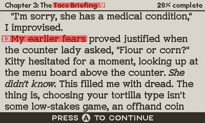
This is an interactive-fiction game. It reads like a book; almost all of it is text. The font here needs to be extremely legible, and its size is 13 px. (By “size” we mean the cap height—the height of an uppercase letter, from the baseline to the top of the letter or an ascender.) This font is also 2 px thick, which helps legibility immensely. It’s not very decorative; it’s made for legibility first and foremost. Any games that rely on lots of text should shoot for a size and thickness close to this.
Note the other two labels: “current chapter,” which is smaller because it’s something the player will only glance at quickly; and the action button at the bottom, which is a little more important, so it’s set in CAPS. Both are legible at 9 px given how little text is set in them. A player might not want to read a whole page like this, though.

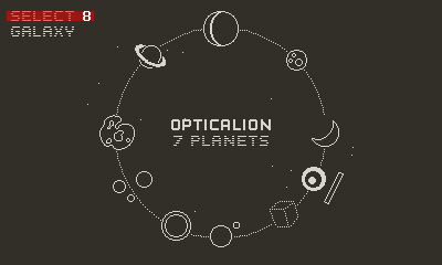
When there’s room to spare and the text is important enough, you should set a larger size, above 16 px. An example of this would be the game’s Start screen, a Pause menu, or other “slow” UI. Usually, we can spare the room here, so let’s be kind to the player’s eyes.

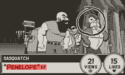
7 or 8 px is as small as you should go with text. It’s largely decorative in this case; it doesn’t really “matter.” Any smaller and the player would do a lot of squinting.
This example also shows “gray” text, created using a dither pattern. It’s an effect that can be handy for “styling” text, but it shouldn’t be overused. Also, consider the background it will be displayed against.
Saving
Most games should save their state where the player left off, or at least to the level where they left off. The decision on where the game should save is up to you, the developer, but the behavior should feel fair and natural to the player. If a game doesn’t save at all, our QA team will make a note of that so that we can evaluate it on a case-by-case basis. We realize it might not always be necessary for the game to have any saving mechanics.
Audio
The audio levels for the game should be consistent and not too loud. Make sure to test audio on a Playdate device, in various environments, to make sure it sounds the way you want it to.
Game Instructions
If possible, provide appropriate instructions on gameplay to help minimize confusion. If some level of exploration and puzzling over the basic functions of your game is intentional, that’s understandable—just make sure it’s inviting and fun for players to discover things on their own.
Our goal with this guide is to share what we’ve found works best, and to prevent issues for players. If you’re in doubt about a particular feature, email us —we’re happy to chat.